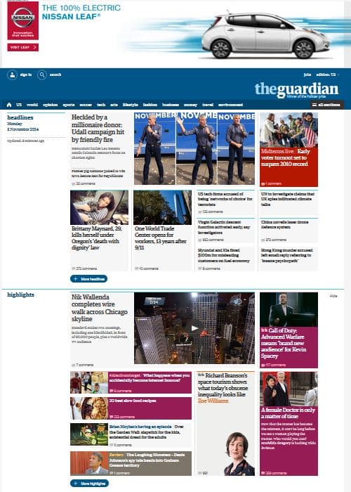
The Guardian Revamps Website to Improve Subscriber Retention
After 18 months of work, 8 months of beta testing and 25,000 reader comments, The Guardian’s U.S. website revealed a sleek, new look last week. Removing the clutter, the revamped site has more white space, is well organized into easy-to-find categories and, in general, is visually appealing. Content is now grouped into “containers” such as headlines, highlights, sports and opinion, each of which contains a “more” feature for additional stories. This layout translates well to mobile,…
The Guardian Revamps Website to Improve Subscriber Retention Read More »


