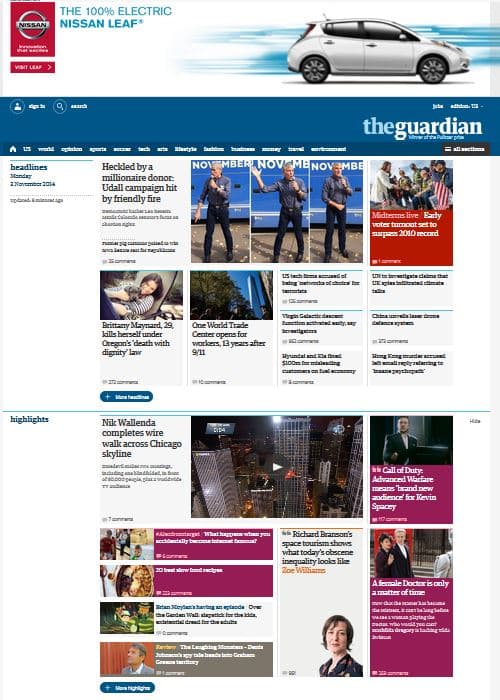

After 18 months of work, 8 months of beta testing and 25,000 reader comments, The Guardian’s U.S. website revealed a sleek, new look last week. Removing the clutter, the revamped site has more white space, is well organized into easy-to-find categories and, in general, is visually appealing.Content is now grouped into “containers” such as headlines, highlights, sports and opinion, each of which contains a “more” feature for additional stories. This layout translates well to mobile, which has become an increasing source of traffic for most news consumers. While The New York Times has focused on gaining mobile users through curated apps, The Guardian’s use of a mobile-optimized site could be interpreted as archaic. However, since many news consumers view news content through social media, a Web-based mobile site might be more ideal for The Guardian, which recently introduced B2C subscriptions. (Note: The Guardian outranked The New York Times for the first time in September, with online traffic at an all-time high of 27 million unique visitors.)In addition, the new site has less advertising, but the advertisers have a more prominent, integrated position. Currently, Nissan has a banner above the navigation bar, and as a user scrolls, a new Nissan ad will open up between the “containers.” This is an interesting feature that many B2C and B2B subscription sites could use effectively, since it only requires selling to one advertiser, but presumably at a higher rate to offer them such an integrated experience.Subscription sites should also check out The Guardian’s navigation bar for insights on how to optimize the user experience. For example, “soccer” is the fourth header, after a tab reading “sports.” One can infer that The Guardian was getting so much traffic for its soccer coverage (from a U.S. audience, mind you) that it was worth calling out separate from sports. Click on the “all sections” tab and returning visitors can easily see their favorite sections under new headings.Most notably, The Guardian got rid of its multi-colored navigation. Previously, each major section – world, business, sports – had its own designated color. This is a tactic employed by the Huffington Post, but there’s been little research studying the effectiveness of color-coding on either engagement or branding. If you know something about color and design for website engagement, leave a comment below.